What App Design Can Teach Us About Good Web Design?
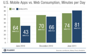
The mobile scene is undoubtedly hot right now. Smartphones are selling like wildfire, and apps industry is proving hugely lucrative for thousands of developers around the world. As technology improves, and as we become more accustomed to having instant access to that much information in our pockets, this is only likely to continue.
But the mobile industry isn’t only important because of the way it’s growing itself – it’s also important because of the impact it’s having on a lot of other industries. This is particularly true for web design, which is being greatly influenced by app designs and the industry as a whole.
The Impact

For starters, a lot of websites these days will be viewed on mobile devices, perhaps more than they will on desktop PCs. This means that like mobile apps, they need to be useful on a small touch-screen display and can no longer rely on thick bodies of text with embedded links.
At the same time though, people are using apps so much these days that they are becoming accustomed to that mode of interaction. This is why it’s important for our sites to take on board some of those important design cues – so that they don’t look dated and so that they remain intuitive for the general public to interact with.
The Design Sensibilities

So how can you make your web design more like an app? There are a number of different points to consider, but here are a few to start you off:
Reduced ‘Chrome’:
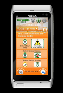
Chrome refers to the various bars and buttons that surround most interfaces for navigation. Across all mobile platforms, but particularly in the new Windows metro UI, efforts are made to reduce this chrome and thus reveal more white space. Interactions should come naturally – such as swiping across the page, or tapping at the side of the screen. This is something you could accomplish on a website for instance with long narrow buttons that would run down either side of the page and remain transparent.
Big Buttons:

When you do use buttons, those buttons should be large enough to be satisfying to press with a finger – the days of small text links in dark blue are pretty much over. They look outdated and they are harder to see on a tiny screen.
Feedback:
People like feedback for what they do – it’s human nature and it makes any interface much more satisfying to use. If you want to make your site more like an app then, you should consider adding sounds, animations and more to your buttons so that there is a clear ’cause and effect’ element to your site. This way people can feel as though they are interacting with something ‘live’ rather than just navigating around a static page.
Animations:

Generally, using animations and movement can help to make your site look a lot more ‘alive’ and interactive. HTML5 is allowing for some truly beautiful sites on desktop computers, so look into using it more.
Content Copyrighted To TechnoWorldNews.com
Latest posts by Techno World News (see all)
- 7 Key Web Design Principles To Create Impactful Web Experiences - June 20, 2024
- Why Your Small Business Needs SEO To Succeed - June 1, 2024
- Ultimate Guide to How Encoders Work: Types & Applications - June 1, 2024


